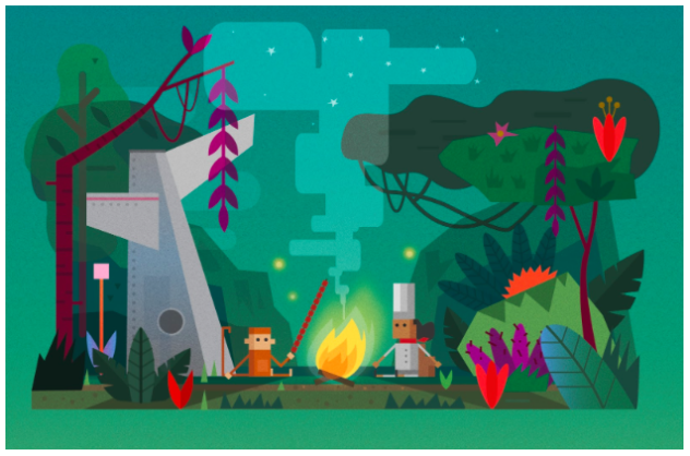
Storytelling is a cornerstone of our strategy for connecting with hard-to-reach students in the math classroom. With respect to design, one of our goals is to craft a product that both students and teachers feel is age-appropriate. Since our last playtesting session, we have continued to study and define how certain design elements affect the perception of age appropriateness.
Our current style is inspired by colorful, flat, vector-based game art. Inspirational examples include Two Dots, Spring Ninja, Monument Valley, and The Trail. This style enables us to create a flexible world, where seemingly anything can happen. Scenes, shapes, and characters readily morph and transition between prompts and activities, connecting stories and mathematics in a more seamless and less contrived way. It’s also a less costly approach to art and animation production, allowing us to quickly create end to-end lessons.
However, we were concerned that by omitting more detail, we were at risk of “aging down” the product. Therefore, we embarked on a testing session to specifically explore the relationship between artistic detail and age appropriateness. Our study group included 8 sixth- and seventh-graders from local public and charter schools.
Survey
We focused on two different aspects of our design: environment and character art. We questioned whether adding more information into the backgrounds and making them visually richer would make any difference in perceived age appropriateness.


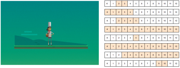
We also considered tweaking the body proportions of our characters. Finally, we tested how introducing additional detail, such as the currently popular line art style (similar to Adventure Time), would be perceived.

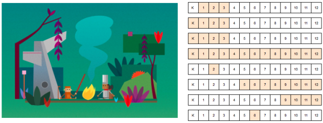
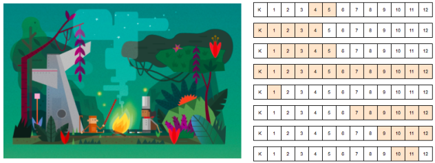
We assembled a brief survey showcasing several variations of the scene and characters above. Students completed this ahead of any content- or lesson-testing to minimize the influence of factors such as content level, sound effects, etc. For each variation, we asked students to indicate for which grades (K-12) they believed the scene was intended.
Results
Here are some representative results from our survey (you can find the complete results here):


Student responses for each variation were spread out, illustrating how subjective design can be. In a follow-up discussion, a small group of students stated that the use of simple shapes in our current designs made them think the intended audience was very young, while more “realistic” scenes were intended for older audiences. When asked to clarify, they responded that more detail (e.g., adding sticks under the fire, stars in the sky, and shading to the trees) made the scene more realistic. Other students suggested that context was instead most important factor in determining intended audience. In the words of one student: “It depends. These scenes could be for anyone. It depends on the story.” In the end, age-appropriateness is not derived from visual style alone. We have found that many other factors like content level, use of motion, sound, and the story itself can contribute to the perceived age appropriateness.
We have concluded that changes to the environment and character art do not affect student response significantly enough to justify the associated cost of implementation. Nevertheless, we are continuing to gather feedback and test small design tweaks. We hope to further improve our testing methodology by randomizing the order of designs seen by individuals and reviewing student survey feedback prior to group discussion (to avoid groupthink).
Finally, we’d love to hear from other teams that have had success testing design with students. Leave a comment with any interesting anecdotes from testing you’d like to pass along!